Porta Creative

Happytos

INDUSTRY

Food & Beverages

WHAT WE DID

Packaging Design, Brand Strategy, Visual Identity

We approached Happytos with one goal: reintroduce the brand to a younger market without alienating its core fans. That meant creating a refreshed visual identity that felt bold, vibrant, and confidently local. Through deep category research, we redefined the role packaging played: not just as a container, but as a conversation starter. We created a flexible design system that could differentiate the product lines while still feeling cohesive under one brand world.

Tortilla Chips

As one of Happytos’ most iconic product lines, Tortilla Chips needed a more confident stance. We gave it just that— with stronger contrasts, assertive graphic elements, and a more structured layout that visually anchors the “OG” reputation of the product. The new design signals freshness and quality while still honoring the familiarity of the old pack, keeping it recognizable but updated for today’s visual landscape.

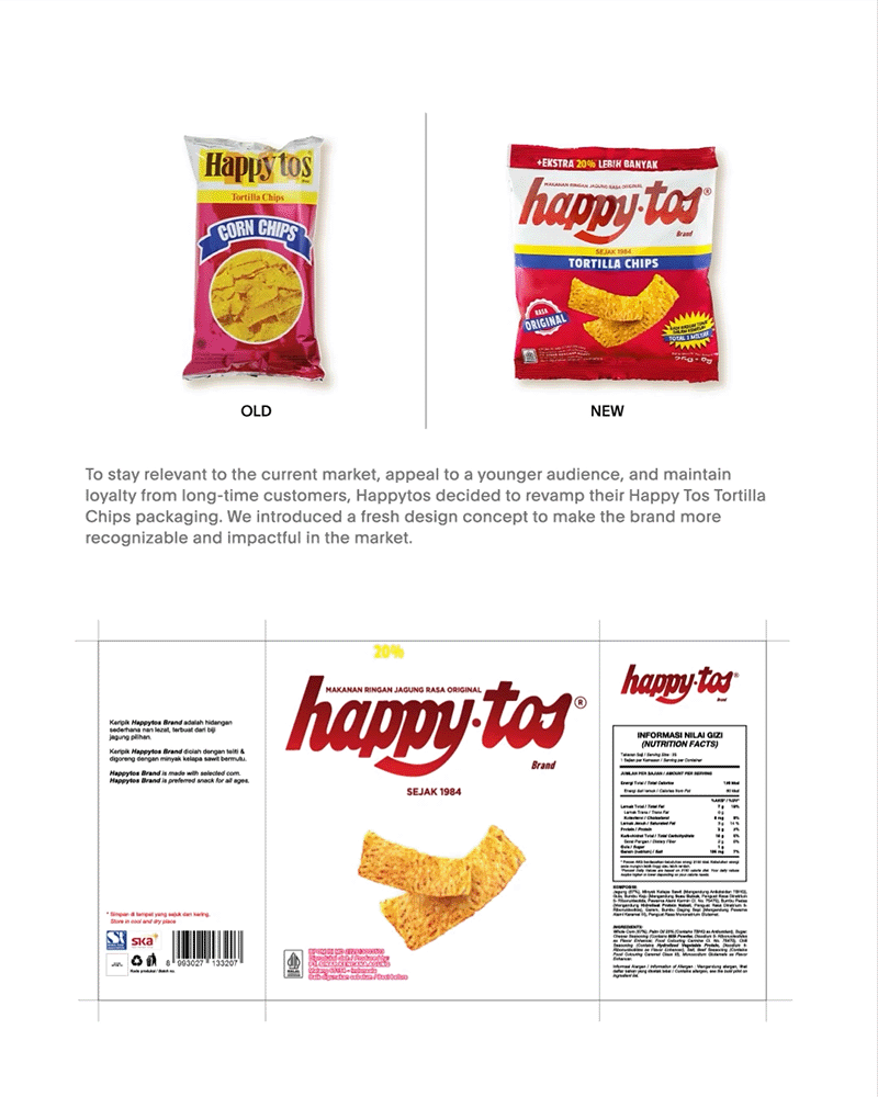
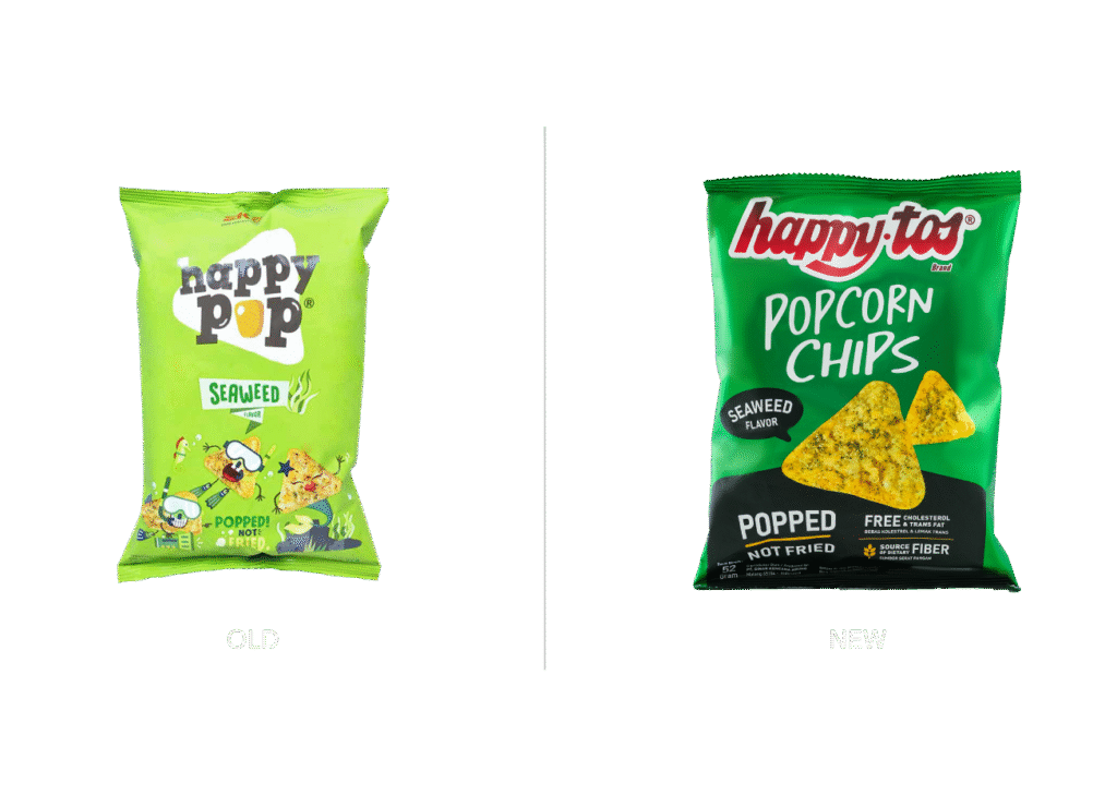
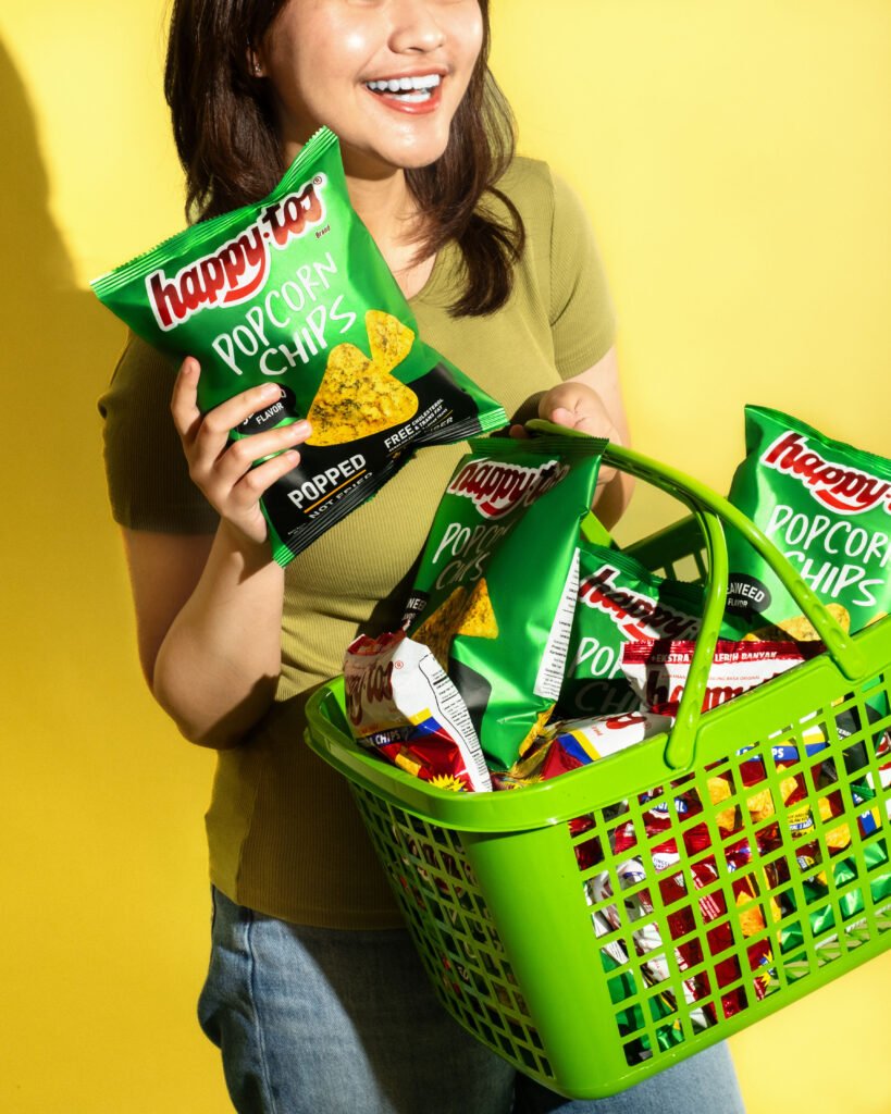
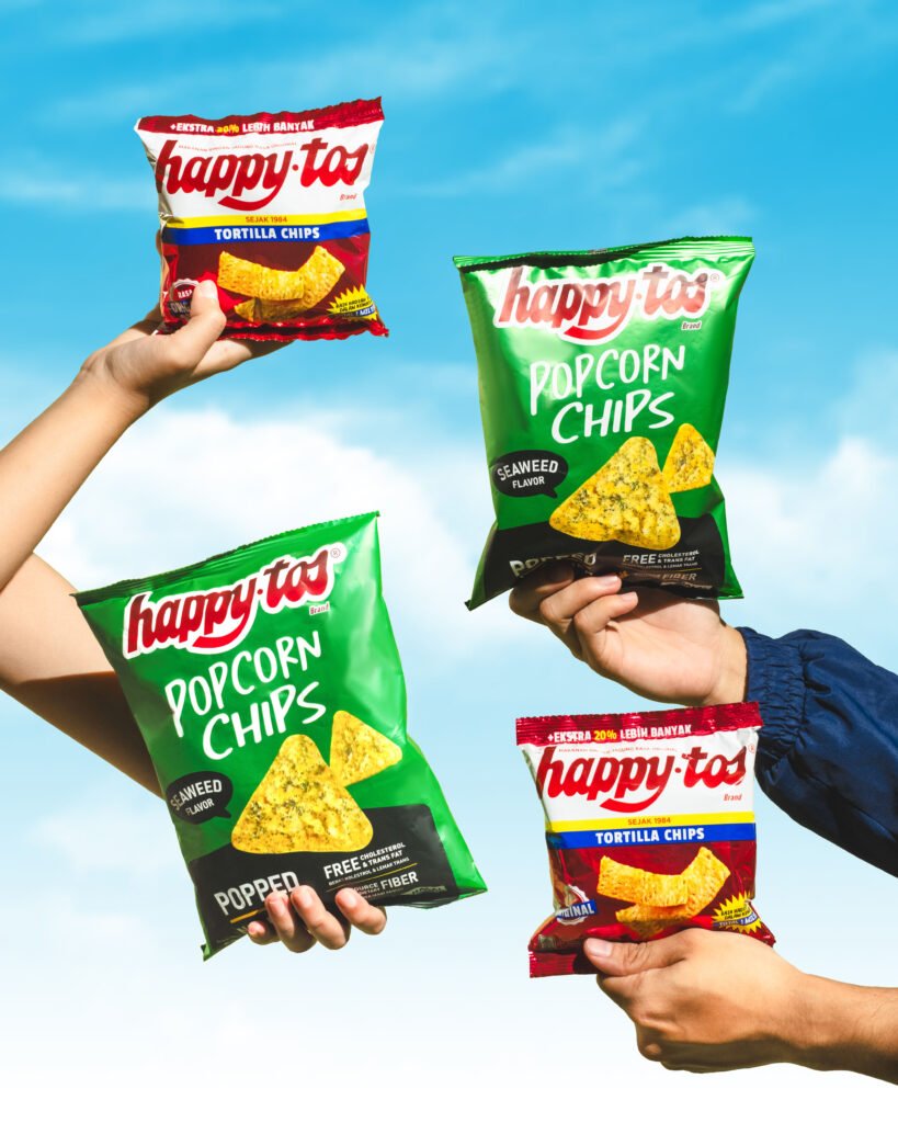
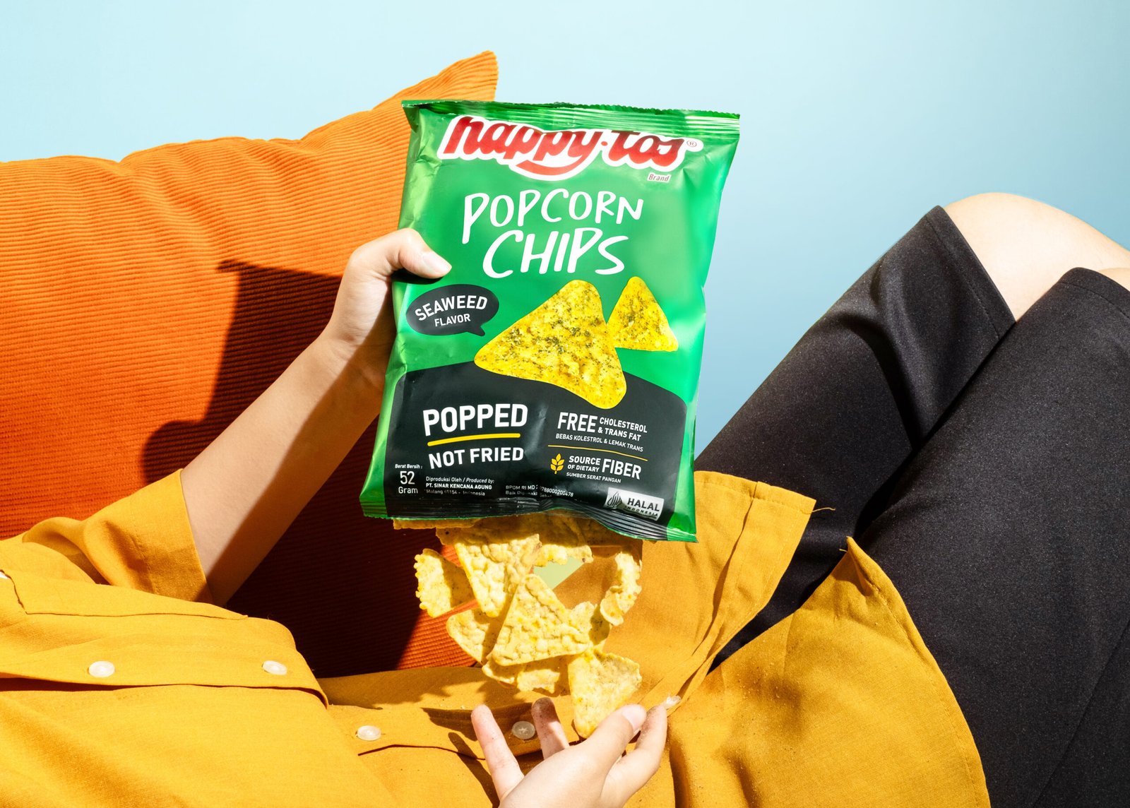
Happytos Popcorn Chips

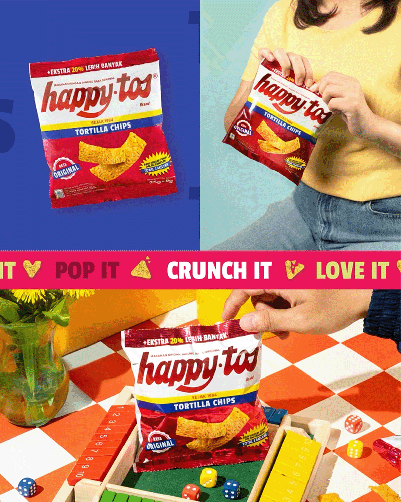
For Popcorn Chips, we dialed into the playful nature of the product. The new look embraces lightness both in color and tone, featuring warm hues, bolder type, and more expressive illustrations that reflect the snack’s unique texture and shape. The result is packaging that feels airy, crunchy, and youthful, making it easier for the product to stand out on shelves and connect with a generation of casual snackers looking for something familiar but fun.