Qua-Li: Rebranding a Legacy Restaurant for a New Generation
Qua-Li is one of those brands most Indonesians recognize. It’s been around for decades, known for its affordable Chinese food and familiar menu. But familiarity can be a double-edged sword especially when your once-loyal customers have grown up, and the younger generation isn’t even looking your way.
That was the situation Qua-Li faced. Once a favorite hangout for high school and college students, it was slowly becoming a brand people remembered, not one they actively sought out. They came to Porta with a clear mission: make Qua-Li feel relevant again.
The Challenge: When Familiar Stops Feeling Fresh
Qua-Li didn’t need to reinvent what made them loved. The food was still solid, the price point was still accessible. What changed was the market.
The younger generation, Gen Z and younger millennials, no longer saw Qua-Li as a place they would visit. The look felt outdated, the vibe didn’t speak to them, and even the menu didn’t reflect current preferences. Our job was to reactivate its relevance.
The Strategy: A Hong Kong Café Reimagination
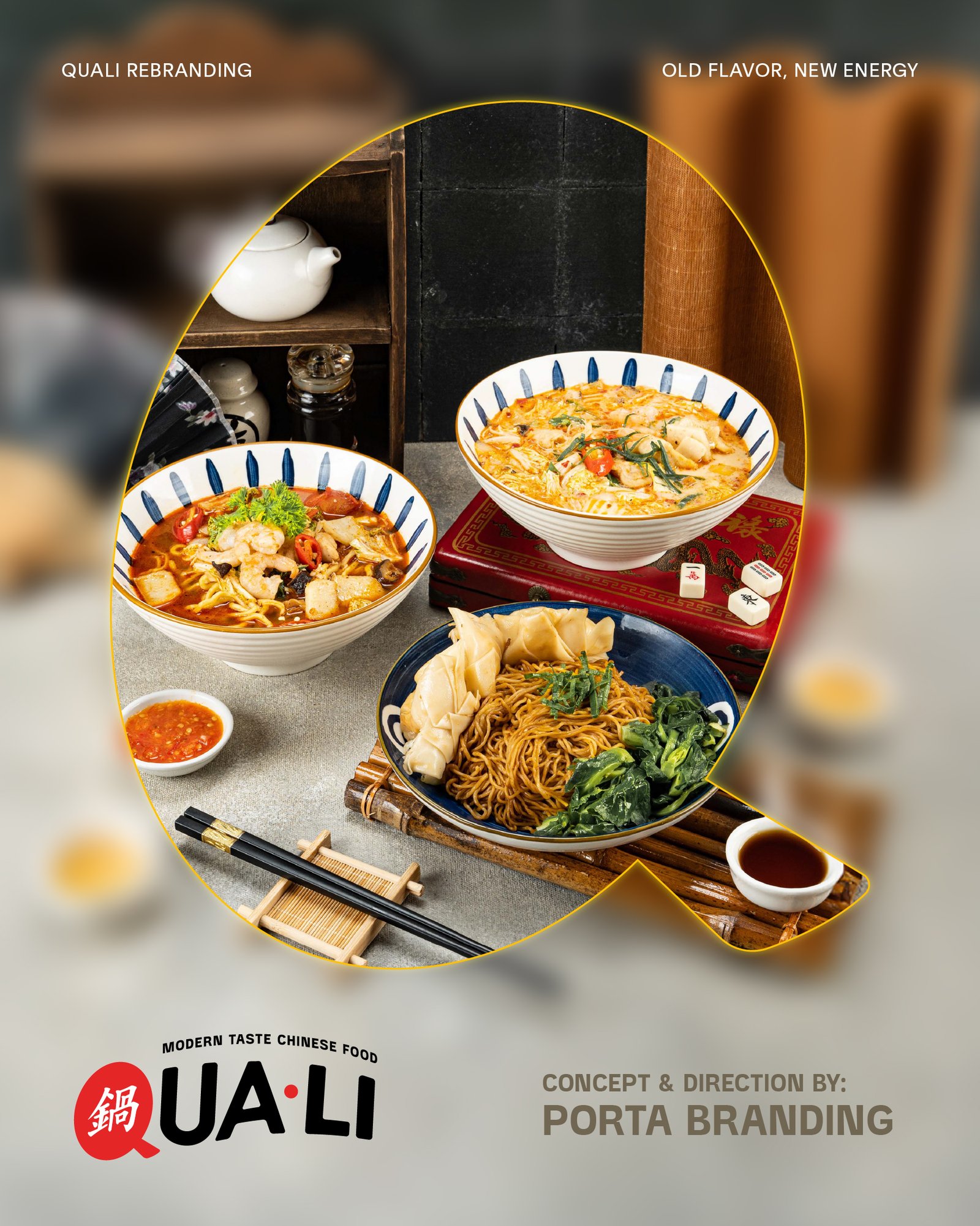
We anchored the rebrand on a new concept: modern Hong Kong café. The idea was to retain the familiar Chinese food core but wrap it in a more stylized, trend-aware experience.
Porta redesigned the logo, giving it a fresher, more contemporary feel while preserving enough of its recognizability. We also developed the interior design concept, built to reflect the vibrancy and urban charm of Hong Kong cafés; think tiled walls, bold colors, and small design details that feel nostalgic but current. We wanted to tell a new story, one that younger diners could connect with again.
Signature Dish Refresh
One of the more interesting (and bold) moves in the rebrand was the menu update. Qua-Li’s signature dish had always been their Nasi Goreng, a safe and universally-loved option. But the team realized: younger audiences wanted something different. So, with our input they shifted the focus to a new signature dish: Kwetiau Goreng. It still fit the cuisine, but brought a fresh edge and a more updated feel to the lead menu item.
It was a subtle shift, but strategically smart. It signaled to regulars and new customers alike: this place is evolving.
The Details That Tie It All Together
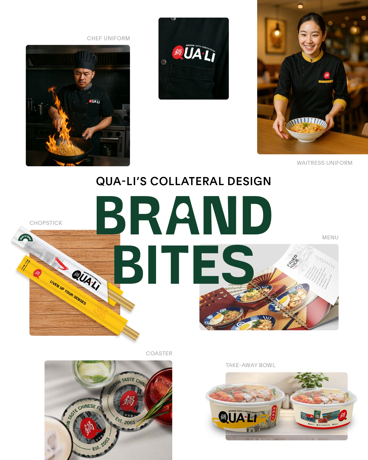
Beyond the big moves, we supported the design of smaller but equally important touchpoints:
Menu book revamp, aligned with the new brand tone and café aesthetic
Utensil design and restaurant stationery, creating a cohesive dine-in experience
Visual assets and printed materials that helped bring the new identity to life across locations
These brand touchpoints might feel minor on paper, but in person they are what elevate the experience. They make the rebrand feel complete.